Since Chiara’s birth, we’ve tracked her daily activities using the Total Baby app on Sabrina’s iPhone. At first, we logged everything—sleep, diaper changes (yes, even color and shape), baths, feedings, and formula amounts. Over time, we focused on just her sleep and feeding routines.
This data helps us ensure Chiara eats enough and stays on schedule. But then we had a thought—what else can we do with all this data?
So, we exported it via email, moved it to a PC, and loaded it into Excel. With Sabrina’s Excel magic, we turned it into a dataset. The export process wasn’t perfect—it’s more for backups than analysis—but we made it work. Now, the real fun begins!
Above is the first graph we got out of the raw export.
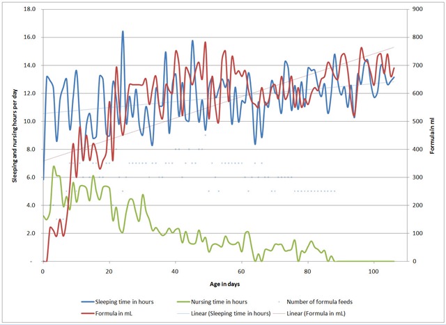
The graph looks nice, but it doesn’t tell us much about patterns. One thing we were hoping to spot was when growth spurts happened or if there was any noticeable relationship between sleep and food. Unfortunately, nothing obvious jumped out.
So, we decided to dig a little deeper and see if there were any correlations between the red and blue lines. The graph top right shows what we found—or didn’t find!
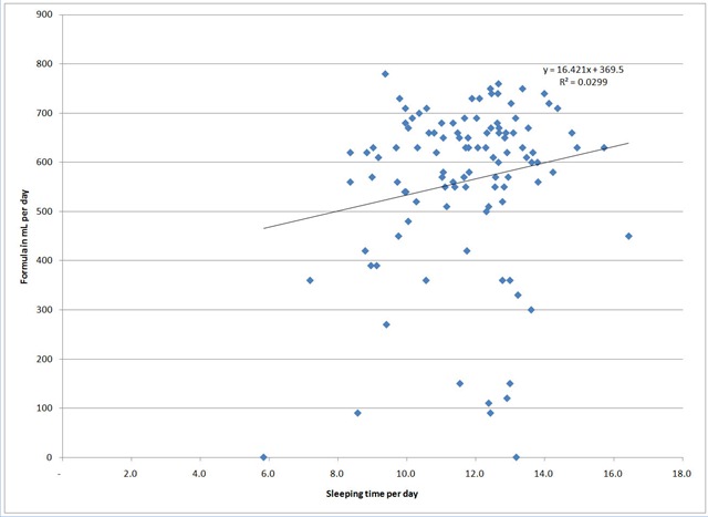
We tried breaking the data into different time periods (since the early days felt more unpredictable), but the results stayed consistent. As you can see here, there doesn’t seem to be any correlation between the amount of milk and sleep time.
Since our initial graph seemed a bit chaotic—daily splits can be arbitrary, and like everyone, she has good and bad days—we decided to smooth things out by averaging the data weekly. The result? Check out the graph right bottom.
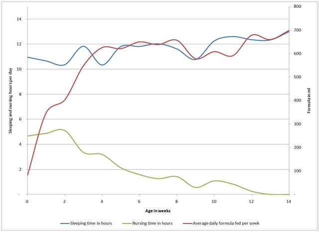
Looking at the data, we might be able to spot two growth spurts—one around weeks 3-4 and another more recently at week 12.
So, what now? Honestly, these graphs don’t seem to reveal any groundbreaking conclusions. Did we really need all this analysis to confirm that kids are unpredictable? Probably not. But hey, we’ll keep digging—there might be a hidden pattern somewhere waiting to be discovered.
Oh, and on a completely unrelated but way more exciting note, Chiara laughed for the first time today! Four times, apparently! Not at these graphs, of course, but at her toys. Priorities, right?
Comments 1
And who is taking care of Chiara while you are doing this great piece of analysis?
As a data analyst and geek I enjoyed reading it however the main info is in yout last paragraph:-)